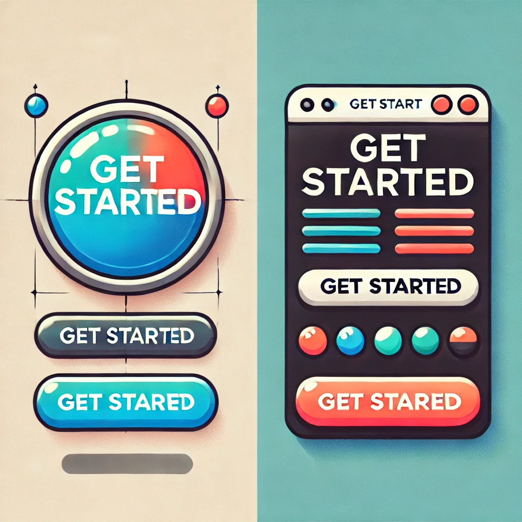
Buttons are the unsung heroes of website design. These small yet mighty elements guide users, drive conversions, and play a crucial role in the overall user experience. In this blog, we’ll explore actionable tips to optimize your button design for higher click-through rates (CTR) in 2025. Whether you’re a seasoned designer or just starting, this guide will help you create buttons that look good and perform exceptionally well.
Why Button Design Matters
Buttons act as the primary call-to-action (CTA) elements on a website. Poorly designed buttons can lead to low engagement, missed conversions, and frustrated users. On the other hand, well-designed buttons:
- Increase user engagement.
- Improve navigation.
- Boost conversion rates significantly.
Creating unique and awesome buttons can elevate your website’s user experience. Here are some ideas
- 3D Buttons: Use CSS animations to give your buttons a 3D look that changes when hovered over.
- Glassmorphism: A translucent, frosted-glass effect with subtle gradients.
- Interactive Hover Effects: Buttons that change color, expand, or animate when hovered over.
- Animated Icons: Incorporate animated SVG icons into buttons.
- Morphing Shapes: Buttons that change shape (e.g., from circle to square) on click.
- Neon Glow: Add a glowing effect to make the button pop, especially for dark themes.
- Gradient Animations: Buttons with gradient colors that move or shift dynamically.
- Particle Effects: On hover or click, show particle effects like sparks or ripples.
- Custom Shapes: Break the traditional rectangle or circle button mold—experiment with polygons, blobs, or abstract shapes.
- Magnetic Button: Create a subtle “pull” effect where the button seems to attract the cursor.
Best Practices for Optimizing Button Design
1. Choose the Right Size and Shape
- Optimal Size: Ensure buttons are large enough to be easily clickable on all devices, especially mobile. A minimum height of 44px is recommended.
- Shape: Rounded corners are more inviting and user-friendly than sharp edges.
2. Use High-Contrast Colors
- Stand Out: Choose a button color that contrasts well with the background. For example, a bright orange button on a white background grabs attention.
- Test Color Psychology: Understand your audience’s preferences. Red can evoke urgency, while green often implies success or progress.
3. Write Clear and Compelling CTA Text
- Use action-oriented words like “Buy Now,” “Learn More,” or “Get Started.”
- Avoid generic terms like “Click Here.”
4. Placement is Key
- Place buttons in highly visible areas, such as above the fold or near the end of persuasive content.
- Ensure there’s enough whitespace around the button to make it stand out.
5. Incorporate Micro-Interactions
- Add hover effects to give feedback when users interact with the button.
- Subtle animations can make buttons more engaging and clickable.
Mistakes to Avoid
1. Overloading Buttons with Text
- Keep the text short and precise. Long texts can overwhelm users and reduce clicks.
2. Neglecting Accessibility
- Ensure your buttons are accessible to all users, including those with disabilities. Use ARIA labels and maintain a contrast ratio of at least 4.5:1.
3. Using Generic Colors
- Avoid using colors that blend into the background or are too common, like grey on grey.
Real-Life Examples
Success Story: Amazon’s “Buy Now” Button
Amazon’s iconic “Buy Now” button is a prime example of effective button design. It’s bold, action-oriented, and perfectly placed for maximum visibility.
Failure Story: Poorly Designed Pop-Ups
Buttons hidden in pop-ups or using vague text like “Okay” often lead to frustration and lower CTR.
Tools to Test Button Performance
1. Google Optimize
Run A/B tests to compare different button designs and placements.
2. Crazy Egg
Use heatmaps to see how users interact with your buttons.
3. Figma or Adobe XD
Design and prototype button variations easily before implementation.
Conclusion
Optimizing button design is a small yet powerful way to improve your website’s overall performance. By focusing on size, color, text, placement, and accessibility, you can create buttons that not only attract clicks but also guide users toward meaningful actions. Remember, every click counts!
Have questions or tips on button design? Share them in the comments below!